Kabel and Nostalgia
In 2010, and again this year, a friend and I designed t-shirts around important soccer competitions, first the World Cup and now the European Championship. By 2010, the Beatles t-shirt designed by Experimental Jetset was well known and much imitated. Before putting lists on shirts, we were already intrigued by all kinds of lists and found that our thinking paralleled Experimental Jetset's statements about their shirt. We wanted to honor players (who are the essence of the teams), were intrigued by the ordering impulse behind list-making, and liked the sound of the names on the international teams.
Unlike the Experimental Jetset shirt, our shirts use the typeface Kabel instead of Helvetica, and we left off the ampersands at the ends of the lines of type.
| Didi's Germany 2012 European Championship shirt, in the German team colors of black and white. |
We were not interested in using the the most reference-free typeface and embrace nostalgia. Kabel bold makes our lists look satisfyingly sturdy, while also suggesting the seventies and eighties, when my friend Sam first became besotted with soccer. We use a version of the typeface that was redrawn for the International Typeface Corporation by Victor Caruso in 1975. Because of the revival of Kabel and popularity of geometric lettering in the late sixties through the early eighties, we are using Kabel in part because of our own nostalgia for a youth more influenced by American advertising than European modernism.
 |
| L'eggs pantyhose logo and packaging, designed by Roger Ferriter, a member of the Herb Lubalin studio in New York, in 1969. The logo is a modified version of Kabel. |
Kabel appeared in a Heinz beans ad mock-up on season five of Mad Men, set in the late 1960s. | |||
| Rudolf Koch, self-portrait, 1905. The original Kabel was designed in the turbulent 1920s in Germany by Rudolf Koch (1876–1934). He crafted the typeface for the Klingspor Foundry in Offenbach in 1926–29 and the prevalent story is that it was named Kabel to commemorate the laying of a telephone cable between the United States and England. (This story may be a myth; the first two-way phone conversations between the US and England did happen in the twenties, but they were radio-based and did not require cables.) Koch was a patriot who fought for Germany in World War I, a devoutly religious man, and a much-loved teacher and artist who was influenced by the English Arts and Crafts movement.
|
| Koch's typeface Neuland, used in 1923 in a tight, flush-left, rag-right design. |
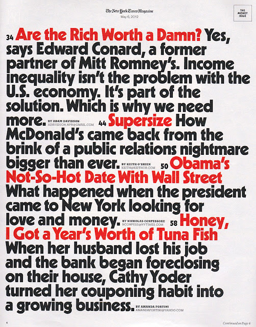
The May 6, 2012 issue of The New York Times Magazine featured a Kabel-like typeface, possibly custom-designed. The issue's cover story questioned the usefulness of the rich, and I wonder if the type was chosen to suggest the mythic hedonism of the seventies and eighties, Studio 54 and Lifestyles of the Rich and Famous.
 |
| The contents page from the May 6 edition of The New York Times Magazine. |


